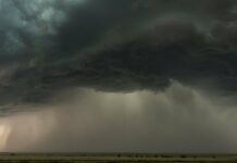
When I woke up on Wednesday morning, I thought my phone was wrong when it showed the time as 7:45. So I checked my watch and my microwave—both 7:45. It was nearly dark out and not because it was dawn, but because the San Francisco sky was choked with wildfire smoke, turning the landscape a Blade Runner dark orange. As I’ve done first thing every morning for the past several weeks during California’s unprecedented outbreak of wildfires, I checked the website PurpleAir—my rock in this summer’s churning Sea of General Awfulness.
Drawing crowdsourced data from air quality sensors it sells to the public—ranging between $200 and $300—PurpleAir builds maps that show in real time just how bad a neighborhood like mine is suffering from particulate matter (PM) 2.5 pollution, the particles that make up wildfire smoke. (PM 2.5 means 2.5 micrometers in diameter, a size the Environmental Protection Agency deems “fine inhalable particles.”) This summer I’ve been checking it obsessively, watching the air quality index, or AQI, swing wildly from the green-is-good indicator that indicates a PM 2.5 score in the low teens up past the alarming purple of a 200 score. I do this knowing that PurpleAir’s sensors are necessarily imperfect, and because they are deployed at home by customers, not by an environmental agency, they are not meant to serve as official measurements of air quality. Still, they’re an important source of data even for government bodies, like the Bay Area Air Quality Management District, whose own sensors feed the EPA’s AirNow.gov tool, which also uses a green-to-purple color scale.
Apparently I’m not alone in my obsession. As AQI scores have soared in the Bay Area over the past month and a half, so has PurpleAir’s business. “We’ve seen 1,000 or more percent increase in traffic on the site,” says Adrian Dybwad, the company’s founder and CEO. “We have a whole heap of emails—people calling. We have a lot of activity going on right now. We’ve had to increase our staff to make more sensors, because we make them ourselves.” Nine thousand of these sensors are now distributed all around the world, which you can see on this map. If you zoom on the West Coast, you’ll see atrocious AQI numbers—some over 700—as wildfires rage across Washington, Oregon, Colorado, and California. (Yes, 700 is higher than PurpleAir’s own map legend, which stops at 500.)
Those sensors work quite differently from the ones the Bay Area Air Quality Management District is using to monitor AQI. Inside a PurpleAir sensor shines a laser beam, which illuminates particulate matter floating in the air, a technique known as light scattering. Think of it like shining a flashlight through the desert—you’ll see all kinds of dust particles moving about. “The intensity of the reflection will give you an idea of the size of the particle, and then the number of reflections gives you an idea of the number of particles,” says Dybwad. A PurpleAir sensor converts these counts into an estimated mass of the particulate matter, which is then converted into the AQI you see on its maps.
By contrast, the BAAQMD’s devices—some 30 of them scattered around the Bay Area—more directly measure mass by collecting particulate matter in filters. These very sophisticated, very precise air quality monitors do that for 52 minutes at a time, then analyze the samples for another 8 minutes, giving the AirNow.gov website an hourly calculation of PM 2.5 pollution. Compare that to PurpleAir, which gives essentially a real-time measure of air quality because it can quickly count particles with that laser, then calculate the mass of pollution from there.
There are a few very good reasons why the BAAQMD’s devices sacrifice speed for accuracy, and for using a system that calibrates with what environmental agencies across the nation are using. “When the EPA, the federal government, makes decisions about air quality on a national level, they can say with some level of confidence that the network in New York is giving you the same type of information as a network in the Bay Area,” says Michael Flagg, principal air quality specialist at the BAAQMD.
This data has to hold up in court when, say, the government needs to prove a company is polluting a given area. Accordingly, the feds have strict policies in place for these AQI-testing machines. “They have to meet certain EPA siting requirements: They have to be greater than 10 meters away from trees. They have to have unobstructed airflow,” says Flagg. “And also the regulatory data undergoes rigorous quality assurance and quality control to ensure the data is accurate.”
PurpleAir’s sensors don’t have to meet these strict rules. People can put them anywhere, including places an air quality expert would know to avoid. Owners might be placing them near chimneys, for instance, throwing off the readings for wildfire smoke. But what PurpleAir might lack in accuracy, it makes up in sheer numbers: AirNow.gov’s map shows one monitor in San Francisco, while PurpleAir’s map shows dozens of monitors within a square mile of my apartment. If one monitor is showing a wildly aberrant AQI reading, and all the others nearby are in general agreement, you get a kind of accuracy by way of averages—and you’re getting it in real time.
“This network is designed to know what the quality is right now,” says Dybwad, of PurpleAir. “And also by virtue of how many there are, you can then say, ‘Look, this one over here is reading, let’s say, green, and I don’t believe that because all of these others are reading orange.’ So just by sheer numbers, it becomes very persuasive in terms of the fact that they all agree.”
And just because PurpleAir’s monitors aren’t as accurate as BAAQMD’s, doesn’t mean the agency’s staffers scoff at the data. It’s quite the opposite, in fact. “The regulatory monitoring network is kind of the backbone of our decisionmaking, and we do that because we can trust the data are accurate,” says Flagg. “And with PurpleAir, we use that data in a qualitative sense. It can be really good at understanding if concentrations are increasing rapidly or decreasing, or if one area is experiencing poor air quality compared to a different area, and things like that. What PurpleAir can be good for is looking at the spatial distribution of smoke during a wildfire, like we’re experiencing now.”
All that data may also be useful in another way, says Adrienne Heinz, a research psychologist at the National Center for PTSD: It’s oddly compelling. For me and many others hunkered down in the orange gloom, relentlessly updating our PurpleAir and AirNow.gov maps offers a way to grasp at some kind of certainty—any kind of certainty—as the Bay Area suffers through this historic collision of disasters. “The more that you can put data into the hands of users, it can be comforting,” says Heinz, who studies the effects of disasters like wildfires and the Covid-19 pandemic. “Obviously, there’s a threshold, right? Like checking PurpleAir 20 times a day, that’s not helpful. But anything that can put it in the hands of consumers and citizens, helps us all come together to make more informed decisions.” So, for instance, timing forays into the outdoors when air quality improves.
Avoiding smoky air is good not only for physical health, but mental health as well. Heinz has found that the mere whiff of smoke can trigger stress among wildfire survivors. And heaping more stress on an already stressed person can only make this unprecedented situation in California more difficult. “When you combine that with folks that already had a lot going on before the pandemic, before the wildfires, have had experiences with wildfires in the past—it’s a recipe for not mentally thriving, let’s put it that way,” Heinz says.
For my fellow West Coast residents, it’s just the beginning of fire season—historically the biggest blazes don’t hit until seasonal winds whip through in the autumn. And things may only get more terrible in future years. The link between the state’s wildfires and climate change is a simple one: The hotter and drier the landscape, the drier the fuel, and the bigger the blazes. Even for people who don’t live in a fire-prone area, you may end up suffering along with us, thanks to the respiratory effects of breathing wildfire smoke, which is now drifting across the country.
Do PurpleAir and AirNow.gov make that dread all the more palpable, putting hard data to the doom? That’ll just be a risk I have to take.
More Great WIRED Stories
- 📩 Want the latest on tech, science, and more? Sign up for our newsletters!
- A rocket scientist’s love algorithm adds up during Covid-19
- Meet the star witness: your smart speaker
- How financial apps get you to spend more and question less
- Parenting in the age of the pandemic pod
- TikTok and the evolution of digital blackface
- 🏃🏽♀️ Want the best tools to get healthy? Check out our Gear team’s picks for the best fitness trackers, running gear (including shoes and socks), and best headphones


