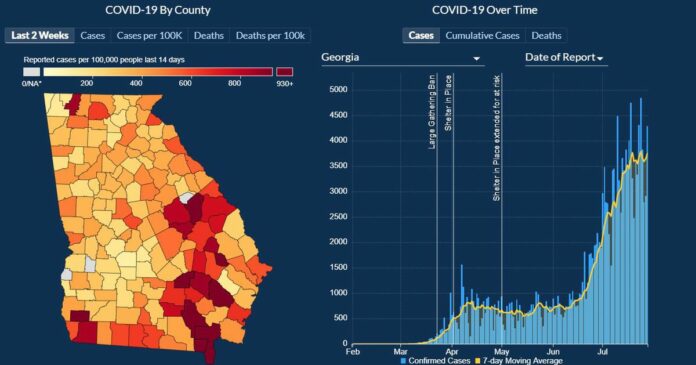
The most significant addition is a new map showing growth by county in the rate of COVID-19 cases per 100,000 people in the past two weeks. That map, which is like one published daily on The Atlanta Journal-Constitution COVID-19 Dashboard, shows users where cases are growing fastest as adjusted for population.
The DPH portal now features maps with new color schemes and legends, and updated charts for cases and deaths over time. The state’s website will continue to publish maps by total cases, cumulative cases per 100,000 people, total deaths and deaths per 100,000 people.
In a news release, DPH said the changes are designed to make the website more user-friendly and provide an accurate picture of the epidemic.
Dr. Harry J. Heiman, a clinical associate professor at the Georgia State University School of Public Health, and a critic of DPH’s data handling, called the changes “a vast improvement,” bringing needed clarity.
“Providing county-level mapping for the the most recent two-week period also provides much more actionable data to both public health practitioners and the public,” he said. But Heiman criticized the department’s continued gaps in racial and ethnicity data.
The agency faced criticism for poor data visualization, leading to confusion. Previous maps featured legends that constantly shifted as new cases were added. That design choice made it difficult to ascertain where cases were rising in the state.
DPH said the new maps feature a white to red color scheme with a fixed scale that will be updated every four weeks. Old maps will be archived for comparison.
DPH also refreshed its charts showing daily reported cases and deaths. The state previously charted cases only by the earliest of either symptom onset, test date or date of test result. Deaths previously were reported only by date of death.
The state’s new website allows users to view cases by date of report or date of symptom onset, and deaths by date of report or confirmed date of death, similar to the AJC’s dashboard.
DPH’s coronavirus case and death charts previously left some viewers with the impression that cases and deaths were falling dramatically in the most recent 14 days, when in fact the most recent days lacked complete data because of lag times in reporting of confirmed cases and deaths.
DPH has suffered a few embarrassing data mishaps since the start of the pandemic. In May, the state acknowledged lumping together diagnostic viral tests, which are intended to find new infections, and serologic tests, which seek signs of past infection, which inflated the state’s testing numbers.
DPH also previously published a bar chart of cases by county that was out of chronological order, making cases appear to be falling when they weren’t. The chart was fixed after online mockery.


